

Display recently viewed products, social proof, coupons, and product recommendations.
View on Shopify App Store ↗Recently Viewed or Recommended Products? Choose the Right Shopify Widget
Match Shopify recently viewed and recommendation widgets to shopper tasks. Inspect product destinations, fit facts and navigation outcomes before expanding.
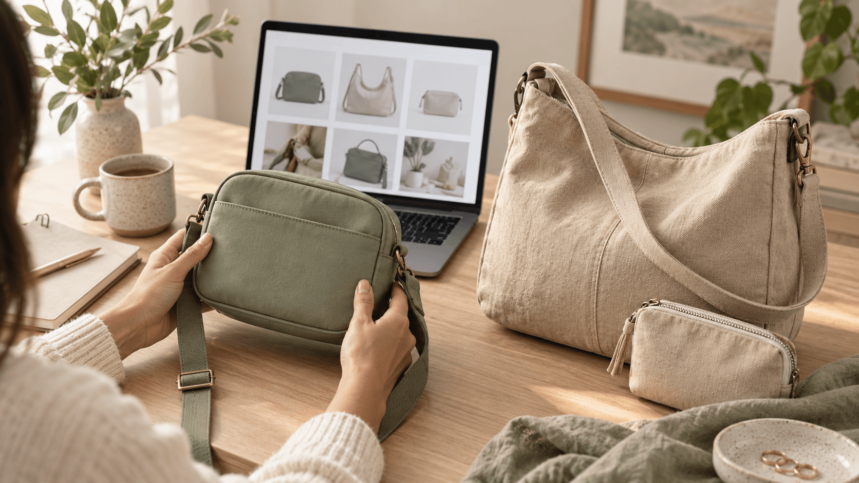
A shopper remembers a green bag but cannot find it again. Another likes that bag but needs room for a notebook. Both may click a product widget, yet they are solving different problems. Choose the widget by the shopping task, then verify what the customer actually sees.
Recently viewed products provide a route back to earlier items. Recommendations introduce possible alternatives or additions. A click on either is an interaction, not evidence that a sale was recovered or that an algorithm understood the shopper.
Name the task before choosing the widget
In a Shopify Community discussion started September 30, 2026, a print-on-demand merchant asked for feedback after receiving some traffic without sales. Replies questioned browsing organization and purchase clarity. These are merchant anecdotes and opinions, not proof that a recommendation widget would fix conversion. Use the question to inspect your own catalog journey.
Shopify Community: product discovery and store feedback
- Find it again: show previously visited items with recognizable images and a direct route to the product.
- Compare options: show a few alternatives whose relevant differences can be understood.
- Complete the purchase: show a compatible addition when there is a real reason to include it.
Label the section honestly. “Recently viewed” describes browsing history; “Other sizes to consider” describes a comparison. Do not label algorithmic selections “Your favorites” unless the shopper actually saved them. Empty history needs a usable page, not a fabricated personal list.
Rehearse two journeys in an accessories shop
Imagine a hypothetical US accessories shop. Its compact crossbody bag measures 22 × 16 × 7 cm. A shoulder bag measures 30 × 24 × 10 cm. These invented specifications are for this example only; replace them with verified product measurements before using similar copy.
Journey A: the shopper views the sage crossbody, visits two collections, then looks for it again. Test whether the recently viewed card opens that product. Check the destination color and current availability rather than assuming the widget retains the exact variant. A remembered image with a different selected color creates another decision.
Journey B: the shopper likes the crossbody but wants to carry a notebook measuring 25 × 20 cm. A recommendation for the larger bag offers a comparison worth inspecting, but outside dimensions alone do not establish internal fit. Show verified compartment dimensions or a real fit demonstration on the destination page. A pouch is an addition, not a substitute for the larger bag.
For both journeys, inspect the card image, full price, useful product name and tap destination. Keep the comparison focused on carrying capacity and fit. The purpose is to reduce navigation effort without concealing the facts needed to choose.
- Start with a fresh browser session and record the empty-history behavior.
- Visit the intended products in a recorded order, then navigate away and return.
- Check whether opening a card preserves the expected product and selected variant.
- Repeat after an item becomes unavailable in an authorized test setup; inspect the visible response.
- Check the same journey on a phone and with keyboard navigation. Essential product controls must remain reachable.
History persistence across sessions or devices is an app behavior to verify, not a promise to assume. Document what your installation stores and where it works, including relevant consent settings. Do not interpret a missing history panel as proof that the shopper never viewed a product.
Use Sales Pop Total for the behavior it actually offers
BeMeApps: Sales Pop Total is the primary app for this guide. Its current Shopify listing describes recently viewed products, recommendations, customizable appearance and reports of impressions, clicks and actions. Use those capabilities to implement and inspect the chosen journey; check the controls available in your installation.
Review BeMeApps: Sales Pop Total features and plans
As checked October 13, 2026, the listing places Recently View in Basic and Products Recommendation in Professional. Verify current billing terms and your installed plan before selecting the feature. The listing's sales and personalization language does not establish recommendation accuracy or guaranteed order-value growth. A report of actions also does not prove a complete purchase-attribution funnel.
If you use Shopify Search & Discovery instead for product-page suggestions, Shopify distinguishes related substitutes from complementary additions. Its sections require a compatible theme and must be added to the product page. That is a separate implementation; do not assume Sales Pop Total inherits Shopify's selection rules or automatically synchronizes with it.
Shopify: Search & Discovery recommendations
Avoid adding duplicate recommendation surfaces for the same task. For layout conflicts with email invitations, use our mobile popup timing guide. For upgrade pricing and additional contribution, use the upsell guide. This review concerns navigation and relevance.
Eggflow: mobile popup timing test
Eggflow: upsells and contribution
Measure the journey without turning clicks into sales
Define the event first: a card display, a card click, a return to the expected product, or a completed order. A repeatedly displayed widget can produce several impressions in one session. Compare counts only when their units and reporting windows match.
Here is an independently calculated hypothetical navigation audit, not an app benchmark: among 240 sessions with a recorded recent-view history and a displayed panel, 36 sessions use it to reopen a product. The return share is 36 ÷ 240 = 15%. In a separately defined recommendation group, 50 of 400 exposed sessions open a suggested alternative, giving 50 ÷ 400 = 12.5%.
These percentages do not identify a better widget: the groups have different tasks and eligibility. Suppose 5 of the returning sessions and 6 of the alternative-opening sessions later place orders within a reliably linked window. Those are observed downstream orders, not incremental orders caused by the widgets. Without reliable session linkage, report separate event and order counts instead.
Record wrong destinations, unavailable items and unresolved fit questions alongside the counts. If the green-bag card repeatedly opens the wrong product, correct that reproducible defect before increasing exposure. If navigation works but orders remain weak, investigate the product offer rather than declaring the widget unsuccessful from clicks alone.
A compact release checklist
- The widget answers one named task: return, compare or add a useful companion.
- Labels describe the actual list and do not invent favorites or popularity.
- Cards lead to the correct product; variant handling and availability are checked.
- Fit and compatibility claims have evidence beyond a thumbnail.
- Empty history, repeat visits, mobile and keyboard journeys remain usable.
- Reports distinguish repeated events, sessions and linked orders, with attribution limits recorded.
Start with the smallest usable display that supports the recorded journey. Keep it when shoppers can complete the task and the evidence supports your decision; revise specific failures before expanding. An attractive widget is only useful when its product destinations help someone choose.
Official documentation, the live app listing and Community discussion checked October 13, 2026. The shop, dimensions and figures are hypothetical. The feature image is an editorial illustration, not an app screenshot or merchant result.
Apps in this guide
Keep exploring
All stories ↗
Grow Your Business
Coupon Clicks Without Redemptions? Audit the Offer-to-Order Journey
Trace a Shopify coupon from banner to order, test eligible baskets, and distinguish clicks from completed code orders with an illustrative funnel.

Grow Your Business
A Daily Shopify Revenue Review: Pick Three Actions From Real Store Data
Turn a completed day of Shopify sales into three reviewable actions, with clear reporting scope, stock checks and a hypothetical stationery-store example.
Grow Your Business
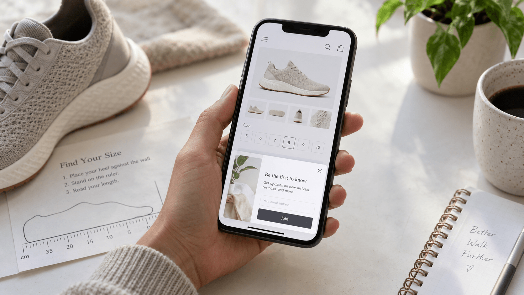
Mobile Shopify Popups: A Timing Test That Protects the Shopping Journey
Test when a mobile popup appears, protect size selection and keyboard use, and compare outcomes with clear eligible-session and exposure counts.